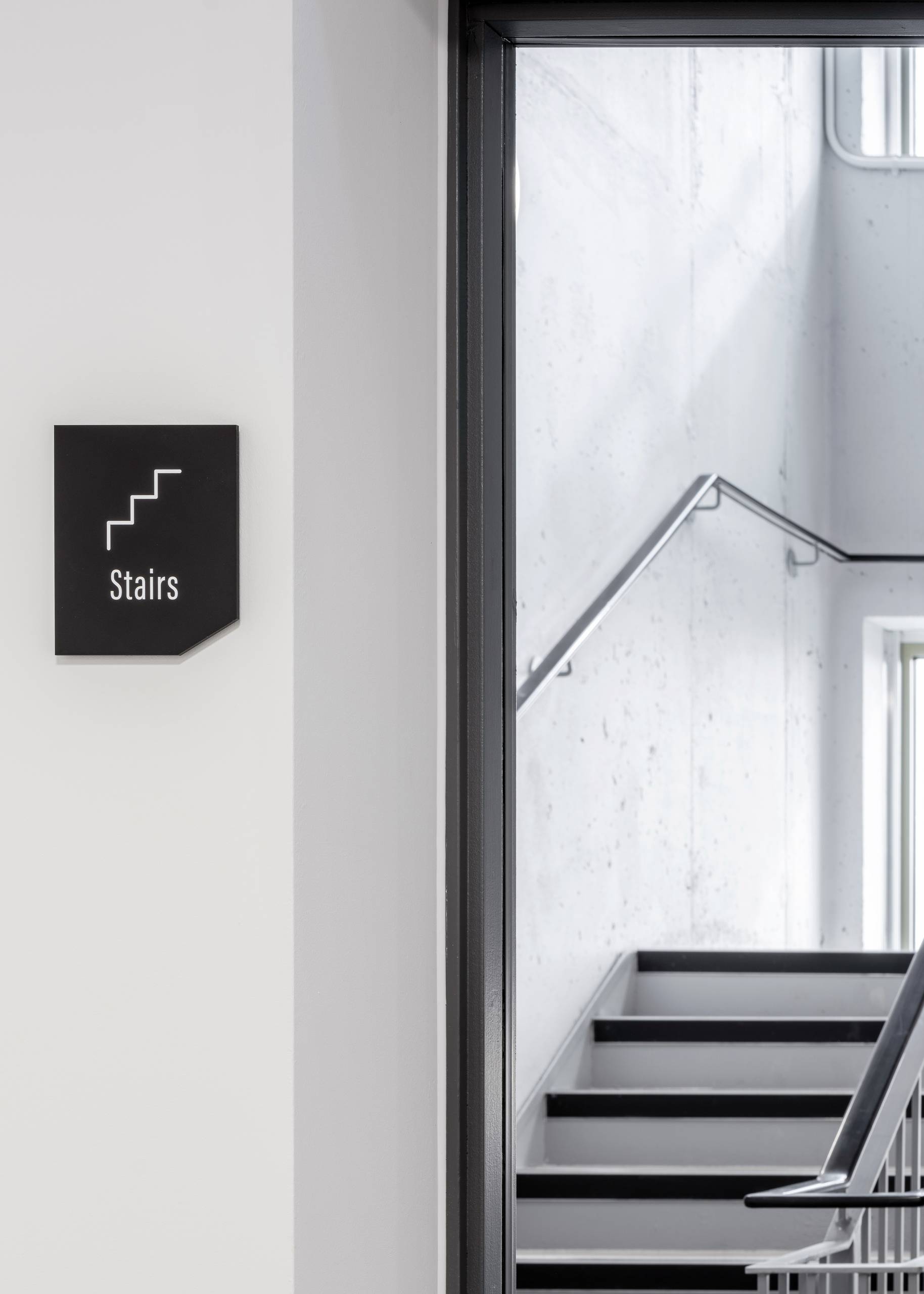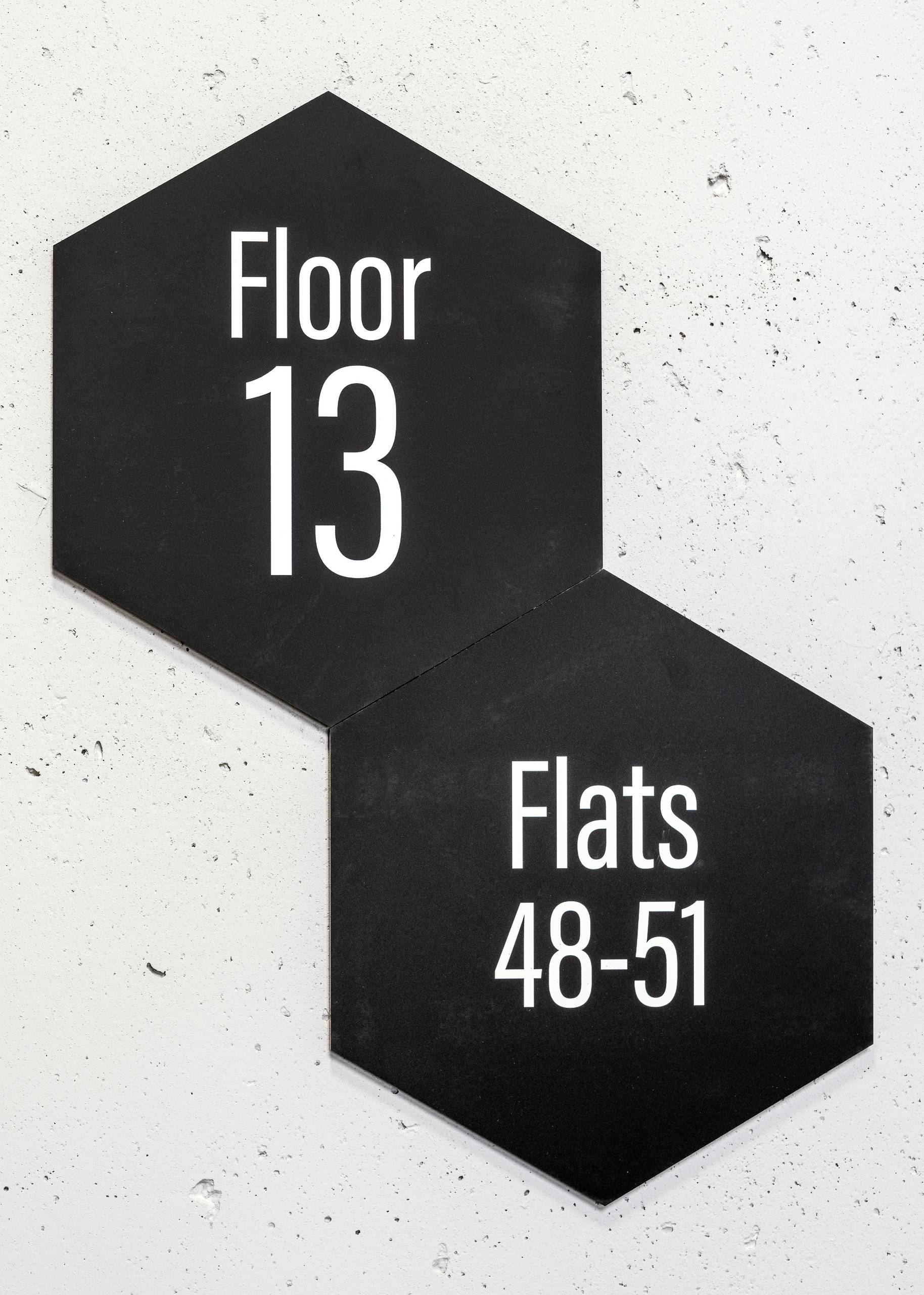
The wayfinding strategy and signage design creates a clear and effective navigation system for Braund Mansions. The design features a distinctive nod to honeycomb, inspired by the area's historical connection to bees and lavender fields.
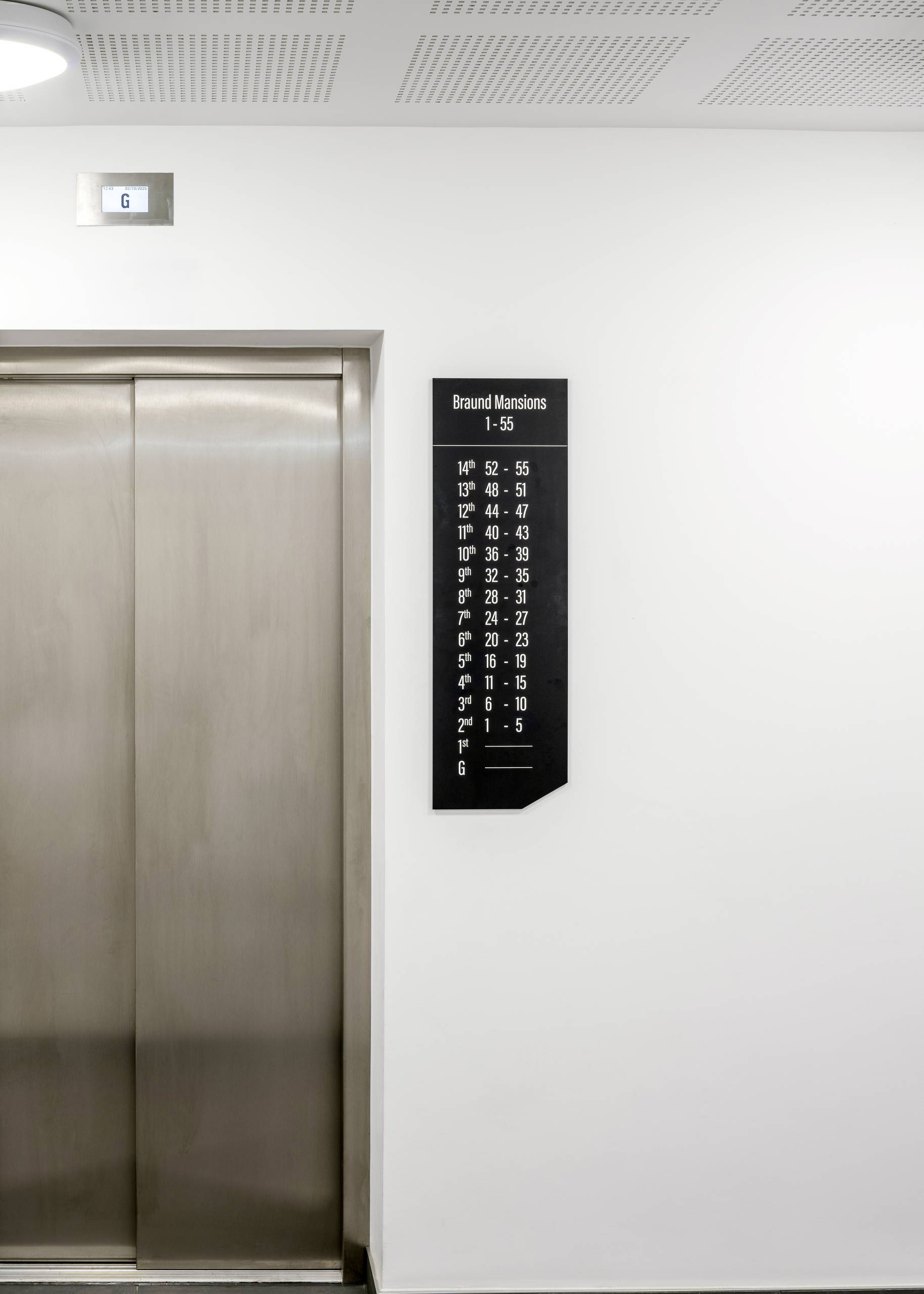
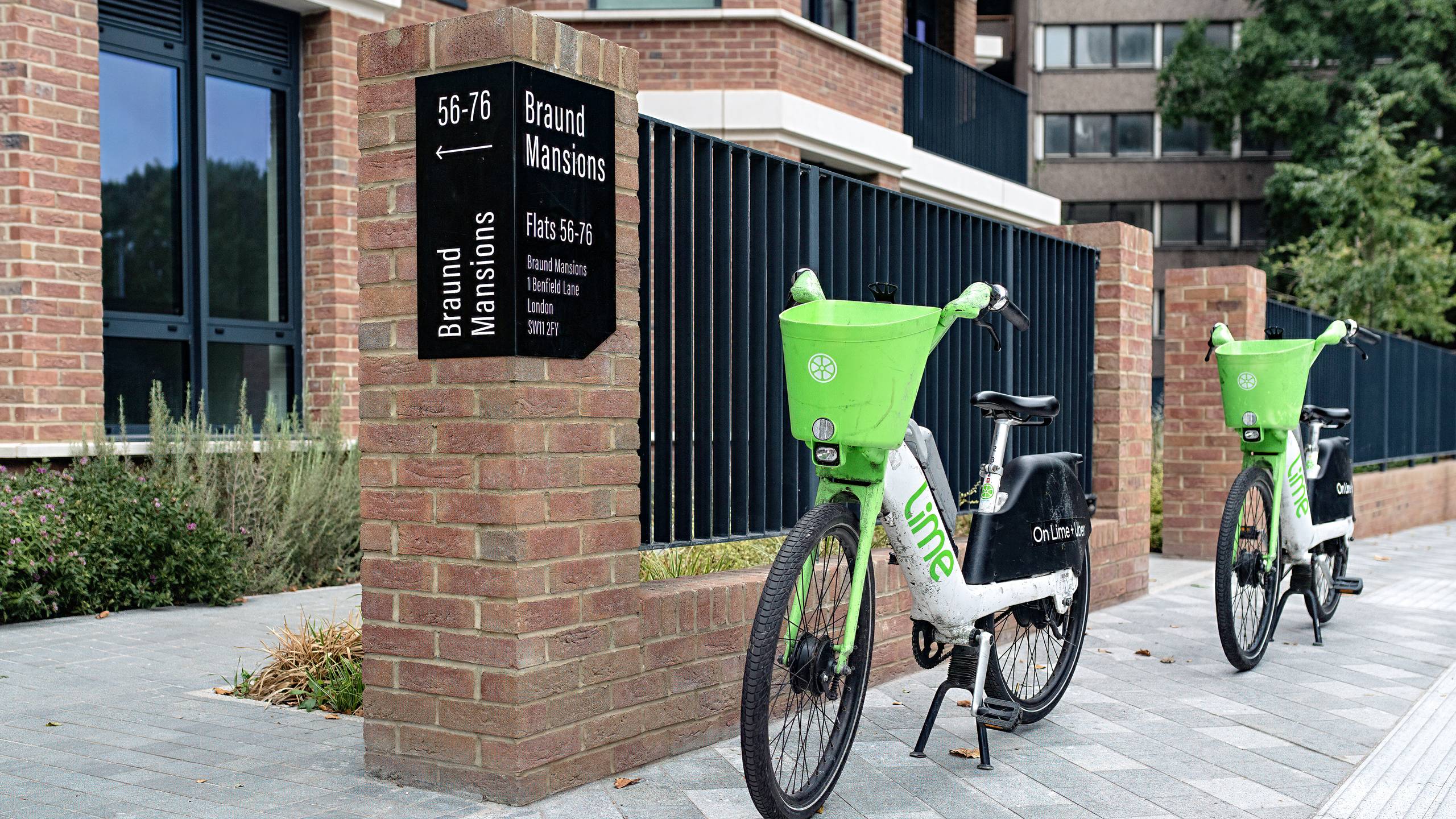
Beyond its aesthetic appeal, our wayfinding solution prioritises accessibility. The signage uses high-contrast black and white layouts and sentence case lettering to enhance legibility for all users. We also incorporated icons to support visual recognition, especially for residents who may speak English as a second language. For longevity and practicality, the design utilises durable, cost effective, scratch resistant UV printed acrylic for the internal signage and aluminium wrapped around the external brickwork for building identification signage.
The comprehensive pack includes all directional, directory and identification signage for each of the three building cores and the external shared spaces.
The signage was designed in collaboration with residents where specific themes relating to the building design, the heritage of the site and further design proposals were reviewed and preferred choices made.
The building was named Braund Mansions after Elizabeth Braund - a local inspiring pioneer and was chosen as the building name by residents through part of our engagement process.